Redesign of the graphic design studio identity
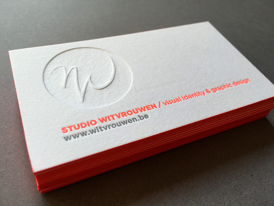
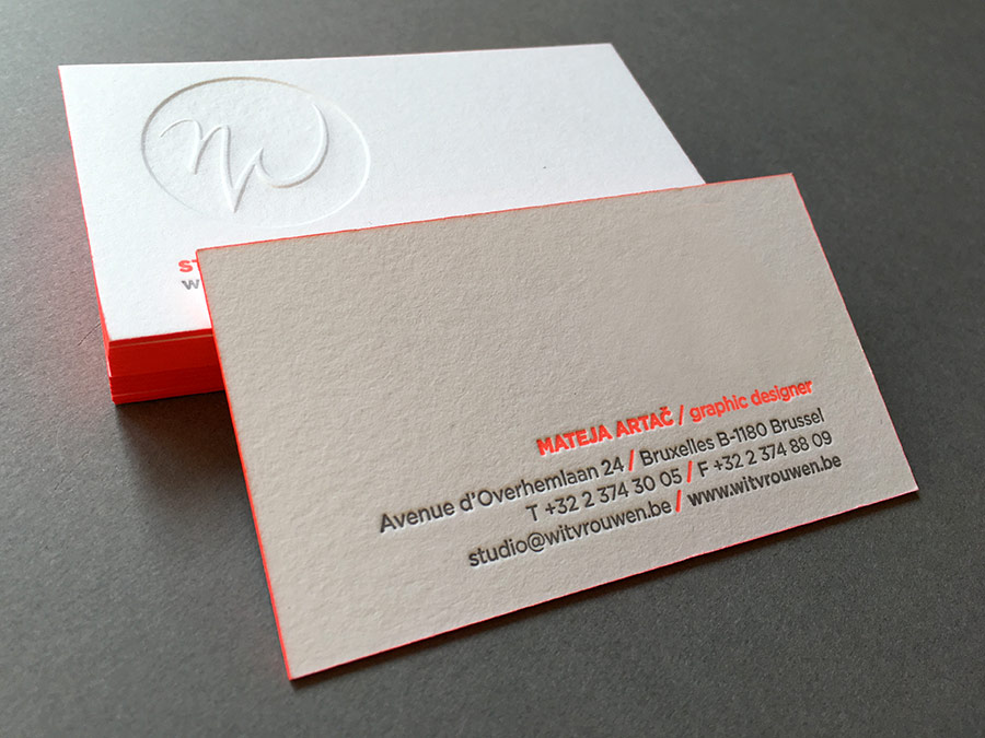
Having been in the business for nearly 3 decades, Studio Witvrouwen had a recognisable logo. The original symbol was kept but used in a new way, fluorescent tone bringing freshness and dynamics. Letterpress business cards correspond well with the artisan character of this small studio where every client is given special attention.
Graphic design / Client: Studio Witvrouwen @ Studio Witvrouwen
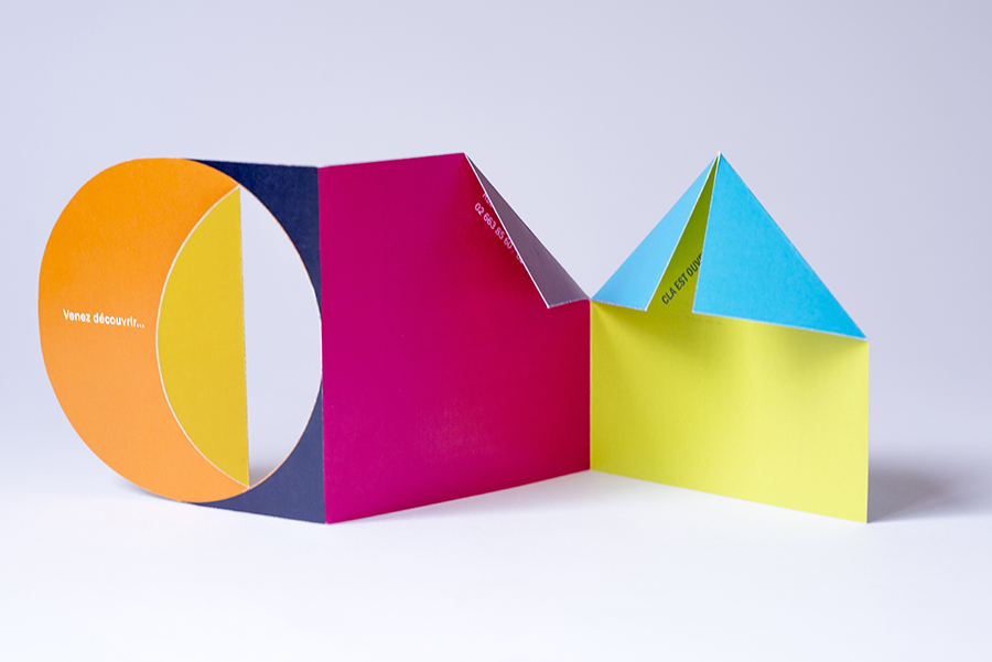
Collection de livres d’artistes
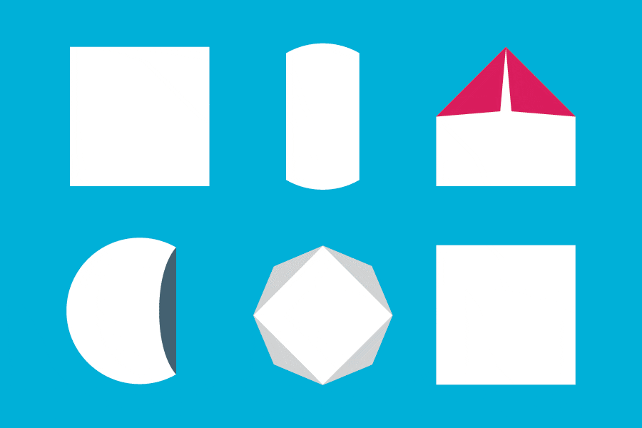
Logo and presentation leaflet created for CLA (Collection de livres d’artistes), artist’s book collection and library in Brussels, Belgium. The fold is what makes the book and is the essence of this playful logo.
Conception, design, realisation / Client: Library of Watermael-Boitsfort, Brussels
 — Presentation leaflet